In our continuing effort in demonstrating how the sausage is made – here’s the story of how our new logo was born. We liken this to the big bang because frankly, it’s nearly as important as that event insofar as its impact to the universe.
So…There comes a time in every band’s life, when they have to choose a logo. Generally this time comes at the beginning of a band’s timeline (unless you’re lazy) and we’re no different. Our first instinct was to find a professional designer. We did this previously, to wondrous (make sure you pronounce it ‘wondruss’ instead of ‘won-der-us’ b/c that’s way cooler) results.

Poster
You can see our logo at the top of this poster.
Album Cover
Here our logo was put together along with some graphics for our album cover.

T-Shirt
This shows our logo rearranged for use on a t-shirt.
After contacting our previous designer, it quickly became apparent that the cost for them to do another logo would be about 10x more than what we previously paid (~$200 originally). Apparently the designer grew up, got a great job at a sweet design firm, and jacked up the prices. Which is cool – we’re happy for anyone’s success. So our search for a new designer continued. We identified some logos that we liked in DC and began looking at the design firms that created those logos. It was at about that time that we began realizing that prices in DC may not necessarily reflect the prices we experienced back in college in Georgia. So we began to design our own.
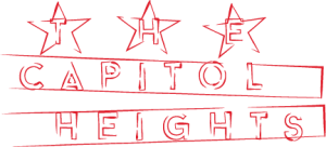
Originally we wanted to go with something DC-themed which makes sense because part of our goal is to be a hyper-local DC band. One of our initial feelings were that the DC flag is soooo overdone. As is using the image of the Capitol and other monuments. So naturally our first concepts did that and didn’t look great. We then tried to avoid doing that. Here are some images of our first handwritten concepts:
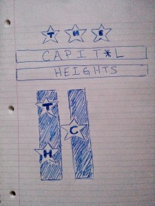
Some thoughts that we were originally going with were:
• Incorporating the top of the Capitol building into the top of the logo
• Use the Washington Monument as the “I” in Capitol
• Make the word ‘Heights’ really tall so it is much higher than the other words
• Use a “star” or “asterisk” as the “o” in Capitol because it might be capital or capitol
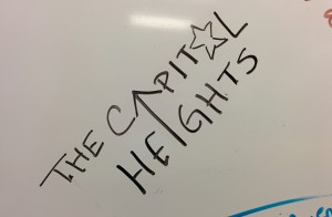
We’re quite happy with the outcome for something we designed and implemented ourselves. Just as the website – it’s sort of a DIY band thing. And after watching a couple of Adobe Illustrator youtube videos – we had this as our first real outcome.
It kinda looks like that Red Hot Chili Pepper’s logo with the asterisk thing they use. I really enjoyed the liberal use of ‘negative space’ where the letters are not actually colored. We then thought it would be neat to put clouds behind ‘heights’. It did not go well.
At this point, we started looking through dafont.com which is sort of the de facto location for stealing fonts on the intertubes. We were hoping to find fonts for inspiration. After iterating a bit we arrived at the following.
At this point the design begins to shift further from the original DC flag, which we viewed as desirable. The manner in which the letters go outside of the lines and keep their red color sounded like such a good idea! But it ended up looking sorta meh. From here we tried a few different things to try making the design pop. Below is but one of the many variations.
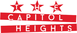
This is definitely not what we were looking for, but it was an idea all the same. We decided to try using an Adobe Illustrator brush to simulate the DC flag’s lines and it turned out looking mighty fine! Additionally, Google I/O 2014 occurred while we were designing, and we decided to use the same shade of red Android is using in it’s latest L release. We also pulled the specific shade of blue we are using for the stars from Android L.
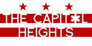
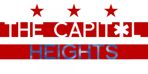
Feeling that we were approaching the finish line with rapid justice, we posted the above logo to the website and it went live! Over the next few days, 1/2 of the band became a little annoyed at how the word “THE” was being portrayed so next that had to be modified. Geez – someone’s persnickety. Making this change caused a problem, because moving the stars in the Illustrator file was a little difficult. After messing with it, we settled on the following design.

And the above design is what we imagine we will be using for some time. When comparing to the original designs pictured above, it’s still pretty close. We’re still using negative space. It still resembles the DC flag, but does not scream LOOK AT ME I’M THE DC FLAG. Okay maybe it does. I don’t know. Of course we expect to iterate on the logo over time so don’t be surprised if it changes. If you have any suggestions on how to improve – let us know!
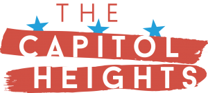
**Update**
We decided to make some modifications to the stars due to a comment from a friend. Now you can see that the blue stars begin as blue but continue on behind the red lines in a dark reddish color. We also added additional stars to the graphic in another attempt to distinguish it from the DC flag.
![]()